
Website Visibility & Conversion
Website Enquiries: Why Is My Service Business Not Getting More?
A practical way to find out whether weak website enquiries are caused by visibility, message clarity, missing decision information, limited proof or a difficult contact route.
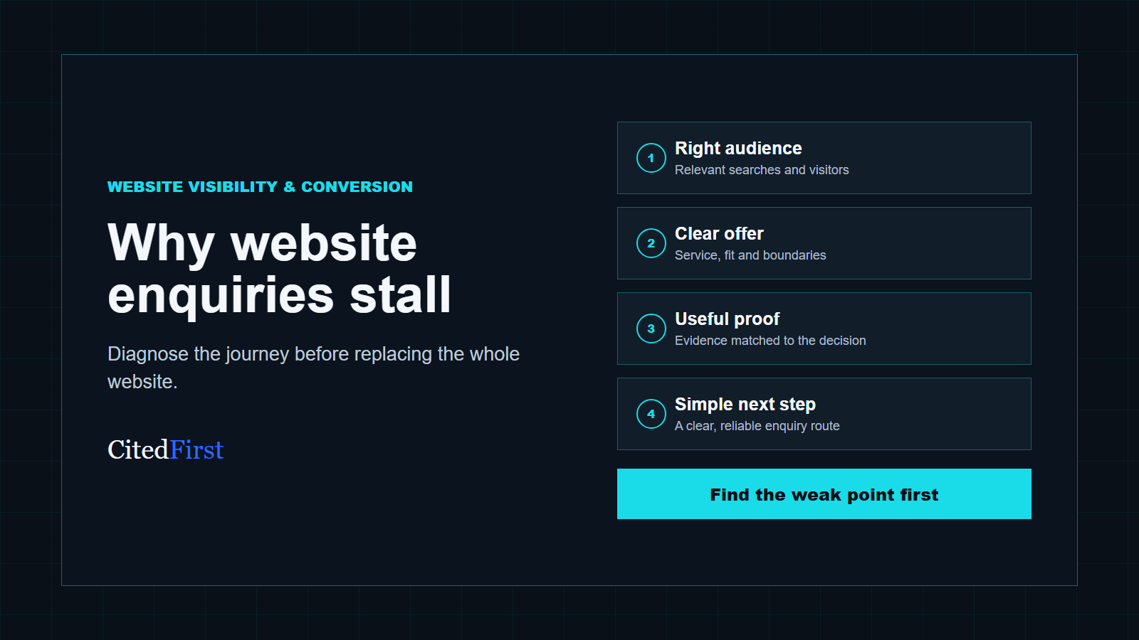
Weak website enquiries usually come from one of five gaps: the wrong people arrive, the offer is unclear, essential decision information is missing, the proof does not support the promise or the next step feels difficult. Start by identifying whether the problem is discovery or conversion. Then inspect the customer journey in that order instead of assuming the whole website needs replacing.
First decide whether the problem is traffic or website enquiries
A website that receives almost no suitable visits has a discovery problem. A website that receives relevant visits but produces few conversations has an enquiry problem. Many businesses have both, but the distinction matters because the remedies are different.
Start with the pages people enter through, the search terms that produce impressions and clicks, and the actions completed on those pages. If the site attracts searches for jobs, free advice, products the company does not sell or locations it does not serve, more traffic will not automatically create better website enquiries. The page may be visible for the wrong reason.
If relevant visitors are arriving, inspect the journey from landing page to contact. Look for telephone clicks, form starts, completed forms, booking actions and visits to proof or contact pages. A low number of website enquiries is more useful as a diagnosis when it can be connected to a specific page and customer need.
| What you observe | Likely issue | Useful first check |
|---|---|---|
| Very few relevant impressions or visits | Visibility or page ownership | Can search engines find a dedicated page for the service? |
| Visits arrive for unsuitable searches | Intent mismatch | Do the title, opening and scope clearly qualify the offer? |
| Relevant visits but no contact actions | Message, proof or next-step friction | Can a customer understand fit and act without searching elsewhere? |
| Many form starts but few completions | Form friction or technical failure | Test fields, validation, privacy text and mobile behaviour. |
| Many contacts but poor-fit leads | Weak qualification | State service boundaries, customer type and useful enquiry details. |
Website enquiries begin with the right audience
A page cannot convert a visitor whose need, budget, location or timing sits outside the offer. The first job is therefore not persuasion. It is recognition. A suitable customer should quickly recognise the service, the situation it addresses and whether the business is likely to help.
Broad language often attracts broad attention. Phrases such as complete solutions, tailored support or quality service say very little about the work. Replace them with concrete service language, the type of customer or project, and the decision the visitor is trying to make. This improves website enquiries because unsuitable visitors can leave earlier while suitable customers gain confidence.
The page should also state important boundaries. A contractor may work on commercial projects but not domestic repairs. A consultant may support established service businesses but not early-stage ecommerce. A company may genuinely cover several regions but not provide emergency attendance. Honest boundaries are part of conversion because they prevent avoidable enquiries and make the offer easier to trust.
Make the offer understandable before asking for contact
Customers should not have to infer what is included from a short paragraph and a stock image. Strong website enquiries are more likely when a page answers the questions that affect the buying decision. Those questions vary by service, but they usually include scope, customer fit, process, operating area, dependencies, available proof and what happens next.
A useful service page can explain the problem it solves, the relevant service options, what information is needed to assess the work and where responsibilities begin and end. It does not need to disclose confidential methods or create a fixed price where the work genuinely needs assessment. It does need to give the customer enough information to decide whether contact is sensible.
Do not force the homepage to carry every detail. The homepage should orient the visitor, while dedicated pages should explain distinct services. The existing service-business homepage checklist shows what belongs in the opening overview and where deeper routes should begin.
Find the point where website enquiries are being lost
CitedFirst reviews visibility, page roles, customer questions, proof and contact routes together, then identifies the most useful priorities.
Request a Free Visibility PlanPut decision information on the page where it matters
Customers often arrive directly on an internal page from search, a shared link or an AI-assisted answer. Treat that landing page as a first introduction. It should identify the business, explain the service and provide a route to relevant proof without requiring a trip back to the homepage.
Useful decision information can include who the service is designed for, common starting situations, available options, the assessment process, project stages, service coverage and the information required for a useful conversation. A high-value or complex service usually needs more explanation because the customer is comparing risk as well as price.
Avoid copying the same company paragraph, testimonial strip and CTA across every page. Website enquiries improve when the proof and next step are relevant to the claim being made. A project example supports delivery capability. A recognised qualification supports a technical competence claim. A clear process supports confidence about what happens after contact.
Use proof that answers the customer’s concern
Generic praise is weaker than evidence connected to the decision. If a customer is worried about project scope, show an approved example that explains what the business handled. If timing matters, explain the planning and communication process without inventing response guarantees. If specialist knowledge matters, show a verified qualification, methodology or relevant project.
New businesses can still support website enquiries honestly. They can explain who is responsible, how the initial assessment works, what information is requested, how recommendations are prepared and what the business will not claim. Process clarity is not a substitute for experience, but it is more credible than unsupported superlatives.
Place proof close to the statement it supports. Sending every visitor to a separate testimonials page adds effort and removes context. Relevant evidence within the service journey helps customers evaluate the page without interrupting their progress.
Give each page one obvious next step
A visitor should not have to choose between six equally prominent actions. Select a primary action that fits the stage of the decision: request a review, ask for a quotation, book a consultation, check availability or send project details. Supporting actions such as telephone contact can remain available without competing visually.
The CTA wording should describe what happens. “Submit” says nothing. “Request a project review” or “Send your service requirements” sets a clearer expectation. The copy around the action can explain what information helps and whether the customer should expect a call, email, booking screen or written response.
Repeat the primary action at sensible decision points rather than after every paragraph. An early CTA helps ready customers. A middle CTA follows important decision information. A final CTA gives the reader a clear route after the complete explanation. This structure supports website enquiries without turning the article or service page into a sequence of sales banners.
Reduce form friction without removing useful qualification
A short form is not automatically a better form. The right fields depend on what the business needs to respond usefully. Name, contact details and a short description may be enough for a simple service. A complex project may need location, service type, timing or an indication of scope.
Every field should earn its place. Explain unusual requests, use the correct input type, keep labels visible, and make validation specific. Never rely on placeholder text as the only label. Test the form at 390px width, with keyboard navigation and with deliberately incomplete information.
After submission, show a clear confirmation and send the notification reliably. Website enquiries can be lost after the form appears to work if mail delivery fails or the message goes to an unmonitored inbox. Record the source page and consent state where appropriate, and verify actual inbox receipt rather than assuming an on-screen success message proves delivery.
Check the mobile journey as a customer would
Mobile problems are often visible only outside the editor. A heading may occupy the whole first screen, a sticky banner may cover the button, a menu may open over content or a form field may extend beyond the viewport. These defects can suppress website enquiries even when the desktop page looks polished.
Open the public page on a normal phone connection. Follow the search result or shared link, read the opening, find the relevant service, inspect proof and complete the contact route. Check text wrapping, button spacing, input keyboards, validation, confirmation and whether the header or cookie controls cover important content.
Page experience should be assessed as a whole rather than reduced to one score. Google’s page-experience guidance encourages site owners to consider multiple aspects of the experience. For website enquiries, the practical question is whether a suitable customer can understand and complete the journey without avoidable friction.
Measure the quality of website enquiries, not only the number
A higher form count can hide a worse commercial result. Record whether each enquiry matches the intended service, customer type and operating area. Note the source page, initial question, outcome and reasons poor-fit leads were unsuitable. This turns enquiry quality into useful content evidence.
If one page attracts many irrelevant enquiries, clarify its scope and search intent. If another produces fewer but stronger conversations, inspect what it explains well. If customers repeatedly ask the same question before proceeding, decide whether the answer belongs on the page.
Use a consistent review period and avoid attributing every change to one edit. Demand, seasonality, advertising, rankings, availability and follow-up can all affect website enquiries. Record changes and dates so patterns can be reviewed honestly.
A practical enquiry diagnosis
- Choose one important service and its owner page.
- Review the queries and visits arriving on that page.
- Check whether the opening qualifies the right customer.
- List the questions a customer must answer before contact.
- Match every important claim with relevant, verified proof.
- Complete the primary contact route on desktop and mobile.
- Review enquiry fit and feed repeated questions back into the page.
Improve the weak part before choosing a redesign
A disappointing enquiry rate does not automatically justify replacing the website. If the platform is stable, pages can be edited, forms work and the architecture is understandable, focused improvements may be faster and less risky. Strengthen the owner page, evidence, internal links and contact route first.
A redesign becomes more reasonable when problems are systemic: the site cannot support distinct services, mobile layouts repeatedly fail, accessibility defects are built into templates, forms are unreliable, performance is consistently poor or routine editing is unsafe. The guide to website redesign versus targeted improvements provides a fuller comparison.
Whatever route is chosen, protect useful URLs, internal links, metadata, analytics and working contact journeys. A visually cleaner website can still lose website enquiries if valuable pages disappear or redirects are missed.
Frequently asked questions about website enquiries
Why does my website get visitors but no enquiries?
Relevant visitors may still leave when the offer is unclear, important decision questions are unanswered, proof is weak or the contact route is difficult. Check the landing page, customer fit and completed actions before deciding that more traffic is the answer.
How can I tell whether the problem is SEO or conversion?
Review whether the site receives impressions and visits for relevant services. If suitable visitors rarely arrive, discovery needs attention. If they arrive but do not act, investigate message clarity, proof, page experience and the enquiry route.
Will adding more calls to action increase website enquiries?
More buttons do not repair an unclear decision. Use one primary action, repeat it at useful points and explain what happens after contact. Too many competing actions can make the journey harder.
Should I shorten my contact form?
Remove fields that are not needed, but retain information required for a useful response. A complex service may need more qualification than a simple booking. Test completion, validation and actual notification delivery.
Do I need a new website to get better enquiries?
Not necessarily. Focused improvements may be enough when the platform, templates and page architecture remain workable. Consider a redesign when the underlying structure, accessibility, performance or maintenance problems affect the whole journey.
Sources and further guidance
Turn the diagnosis into a practical priority list
The Free Visibility Plan reviews the pages, search intent, information and enquiry routes that matter most to the business.
Request your Free Visibility Plan